OVERVIEW
PicMonkey mobile app growth and brand expansion initiative.
CHALLENGE
As the PicMonkey photo editing and design product matured, the company invested in elevating the mobile app to build brand awareness, reach a broad design audience, and drive conversion to desktop subscriptions.
I was the lead visual designer to partner with the mobile marketing, product designers and development team to bring this vision to life. The project goals were to revamp the App Store presence, highlight the new Pro subscription model, and redesign the app homescreen visuals for a more polished, conversion-focused experience.
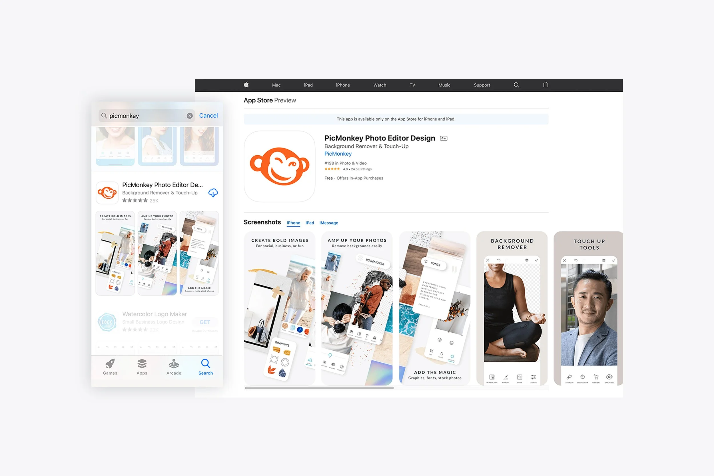
The team worked with an external agency who provided recommendations on how to optimize the App Store to increase downloads. Some of the take aways were specific key words in the description, aligning screen shots to actual app content, adding videos. In addition, I did a competitive analysis of what other companies were doing in the space to find ways to stand out and appeal to a wide range of users.
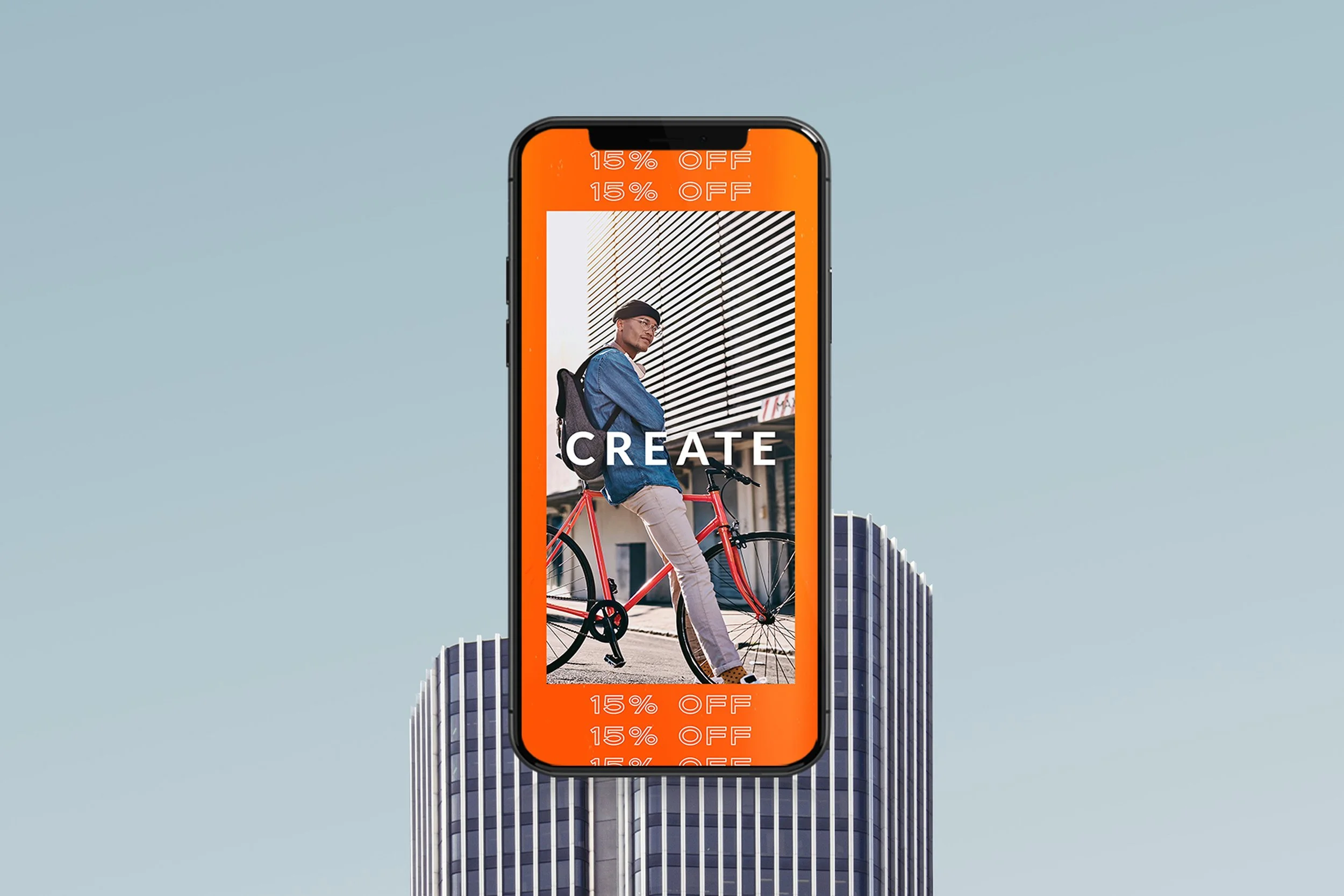
Historically, PicMonkey’s target users were hobbyists. With this app store overhaul and in-app homescreen refresh, the target users shifted to small business owners, designers, social media marketers and those interested in creating marketing and like content on their phones and on the go.
PROCESS
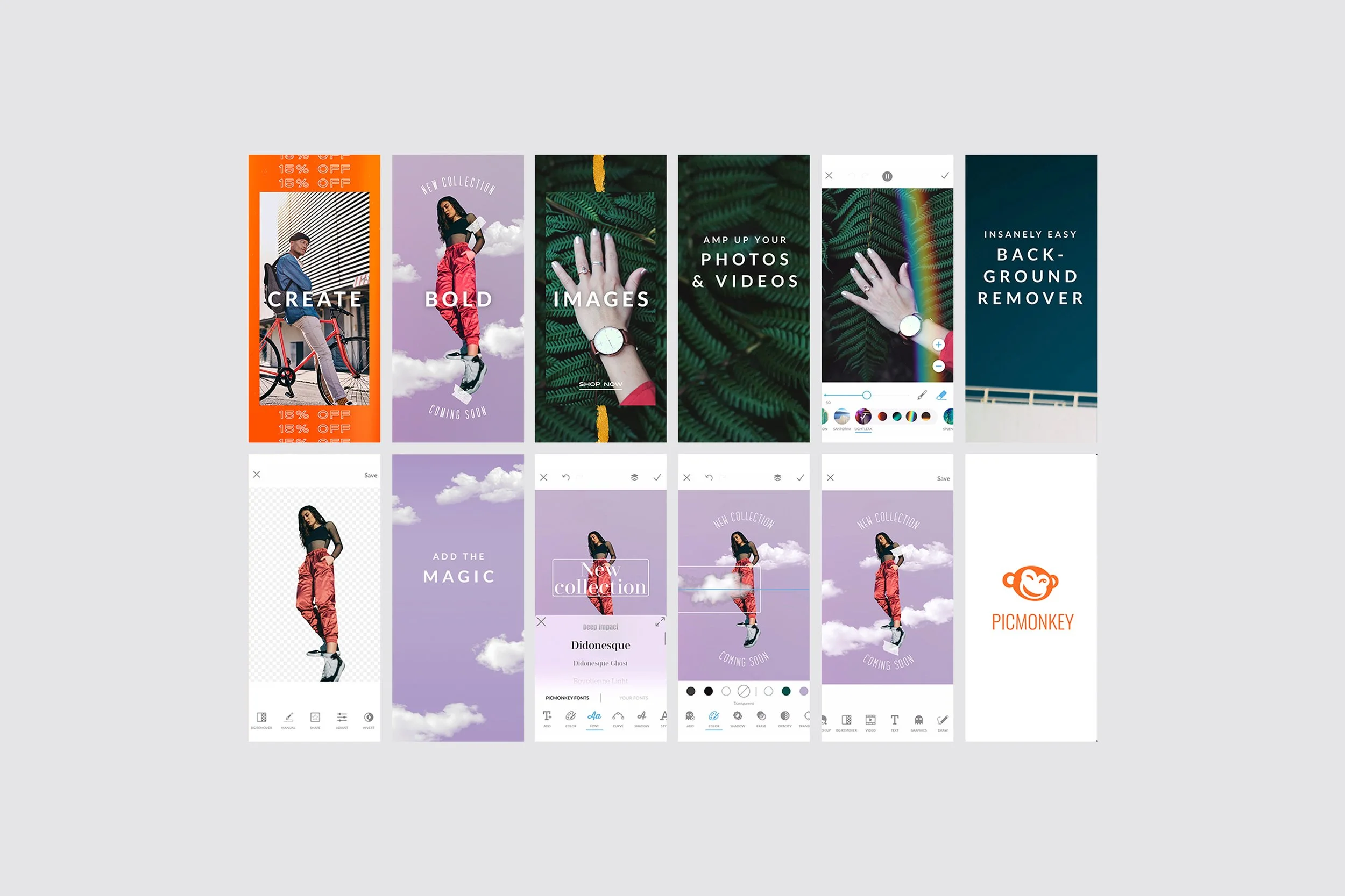
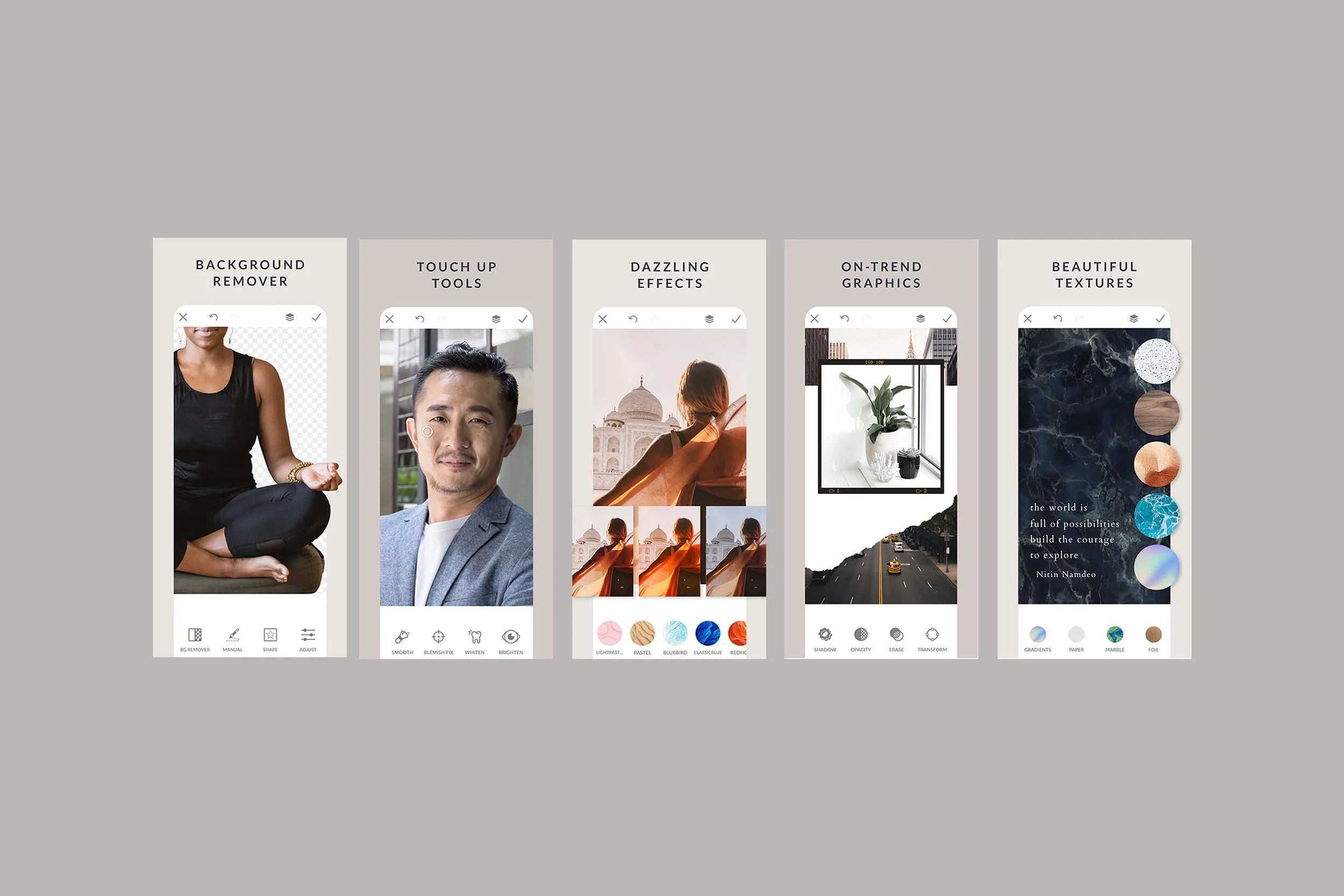
App Store Video
App Store optimization was further supported by a 30-second preview video that brought the design process to life, highlighting key features such as background removal, video effects, curved text, and trending graphics.
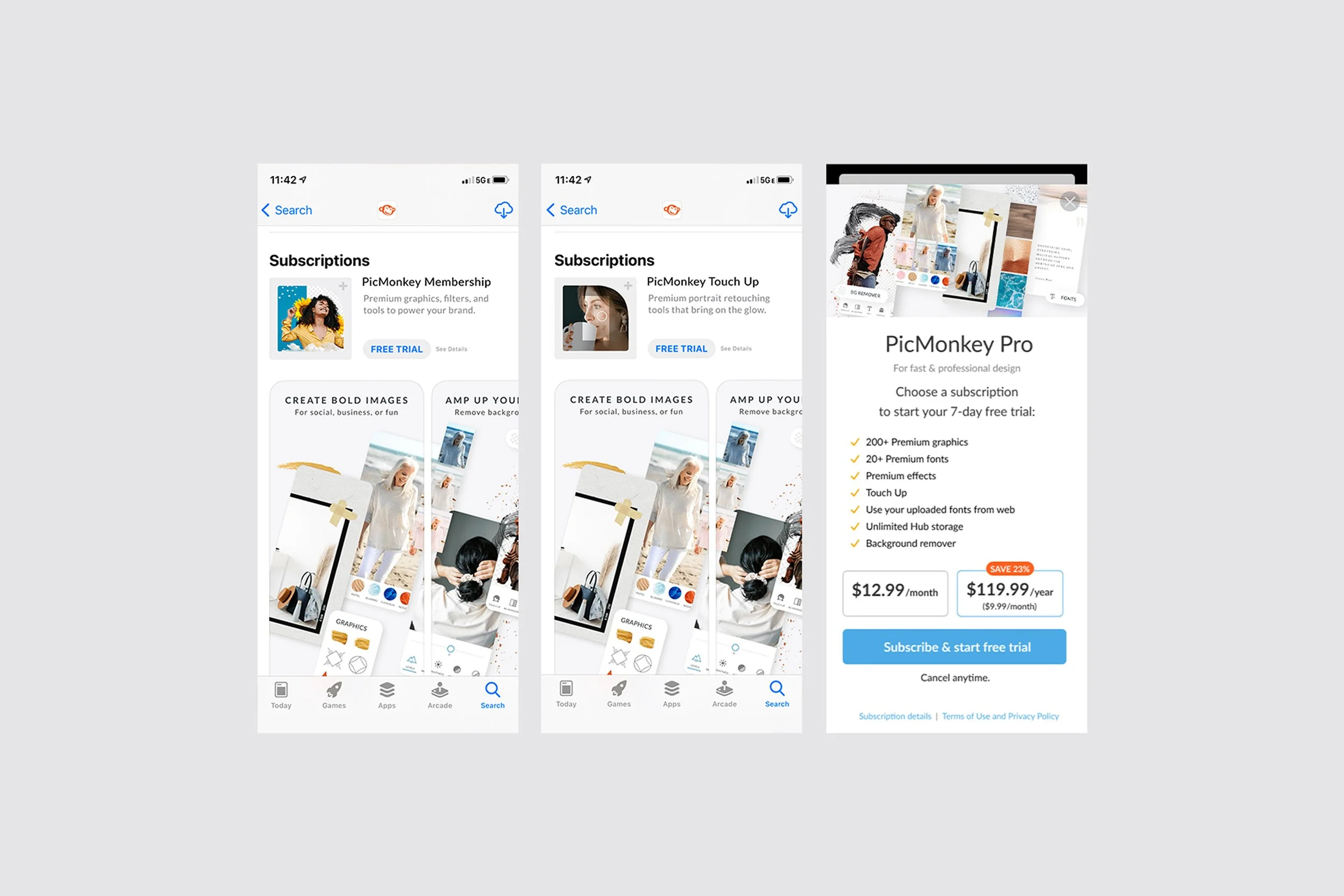
PROCESS
App Store Subscriptions
In parallel, Pro Subscription creative was developed to test App Store–driven conversion, supporting the purchase flow with clear subscription callouts and consistent imagery reused both in the App Store and in-app plan pages.
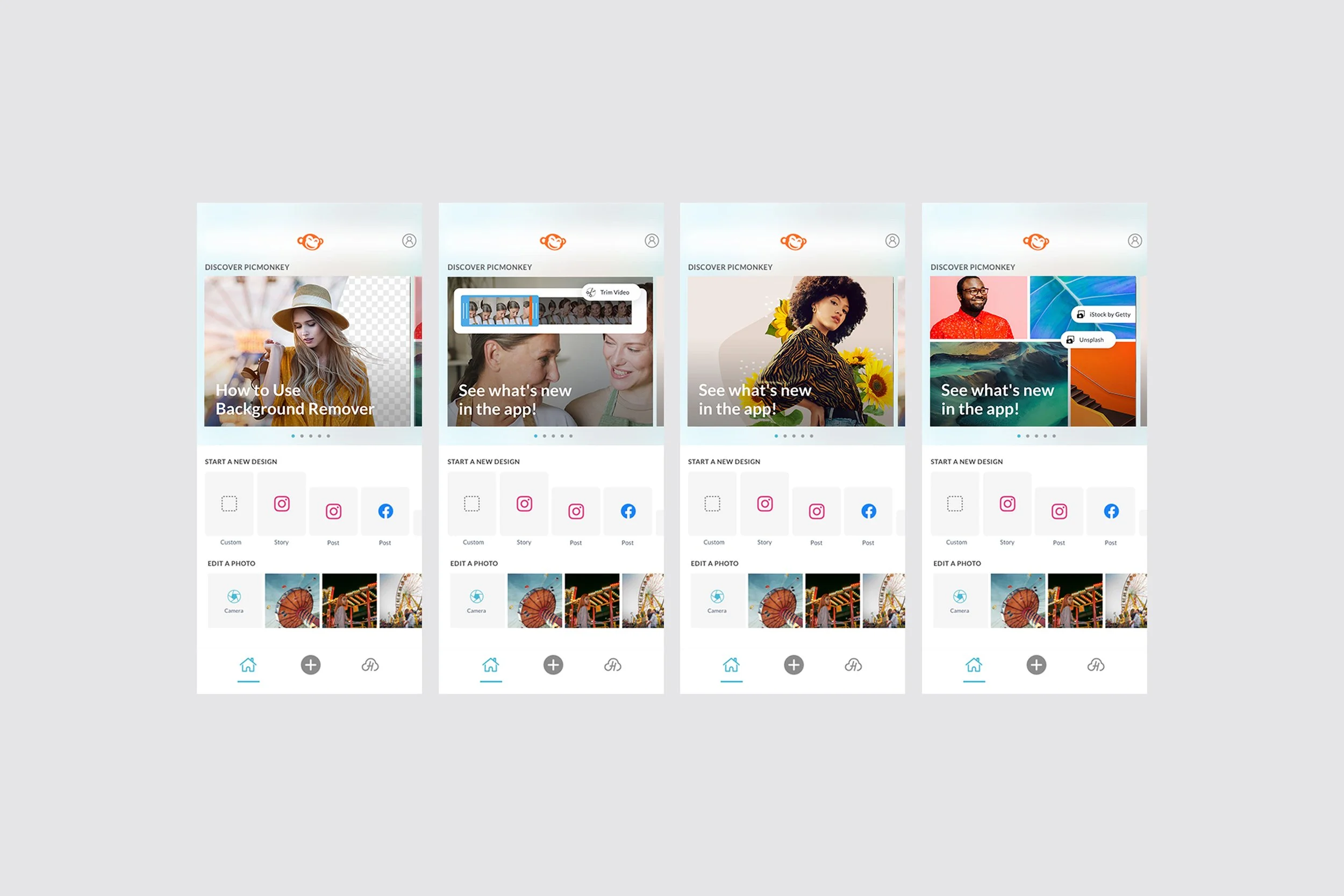
PROCESS
In-app Homescreen Modules
Additional in-app creative included regularly refreshed home screen tiles that promoted new and featured tools.
RESULTS
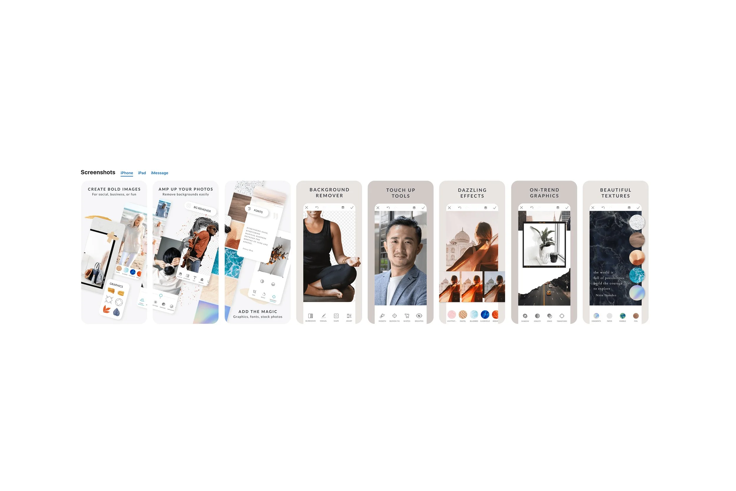
The App Store creative focused on presenting the mobile app’s capabilities in a refined way that positioned it as a professional-grade tool rather than a hobbyist product.
I focused on showcasing on-trend designs, and reinforcing a more mature visual brand aimed at designers and small business owners. The work highlighted popular graphics, tape, frames, and brush strokes, used a muted, sophisticated color palette to stand apart from brighter competitors, and featured diverse imagery across age groups.
This was an important milestone for the mobile development team and was a successful partnership between product, design and marketing to showcase the capabilities of the tool.