OVERVIEW
Foundational work done for the Atmos™ Rewards Visa® credit card content pages as the team began exploring and understanding what Atmos brand would look like in the digital space.
CHALLENGE
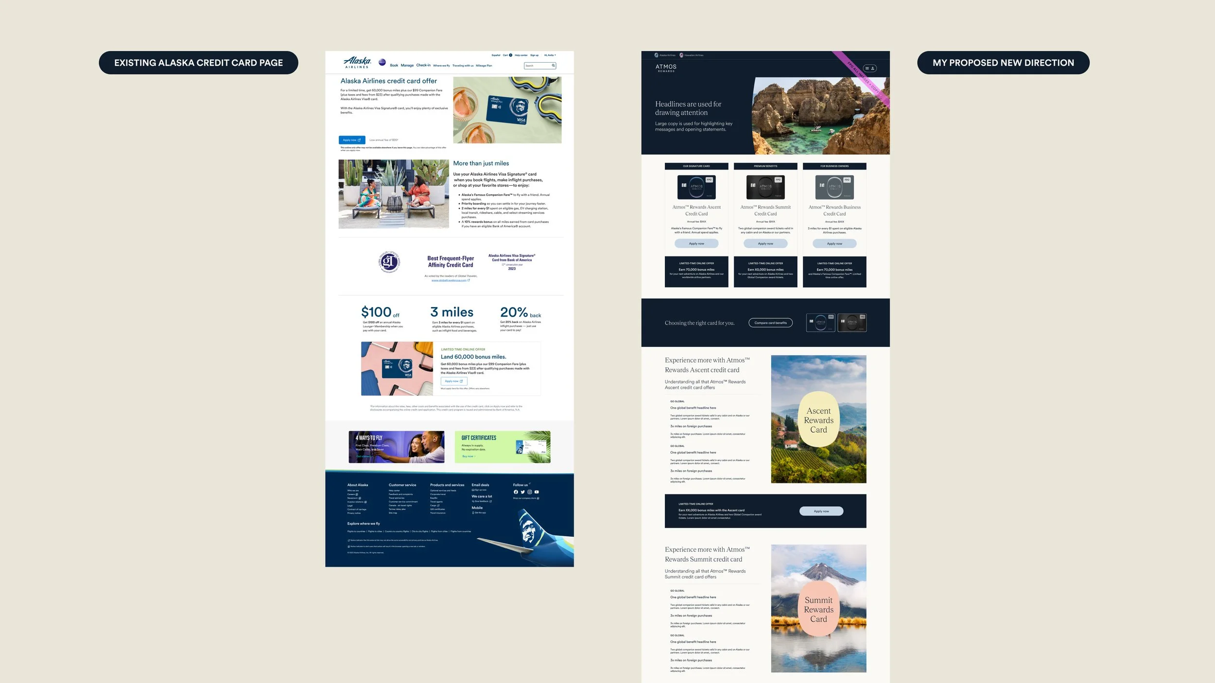
These were the first explorations not only for the new credit cards, their programs, and offerings, but also the first explorations of Atmos content pages within the broader Atmos brand.
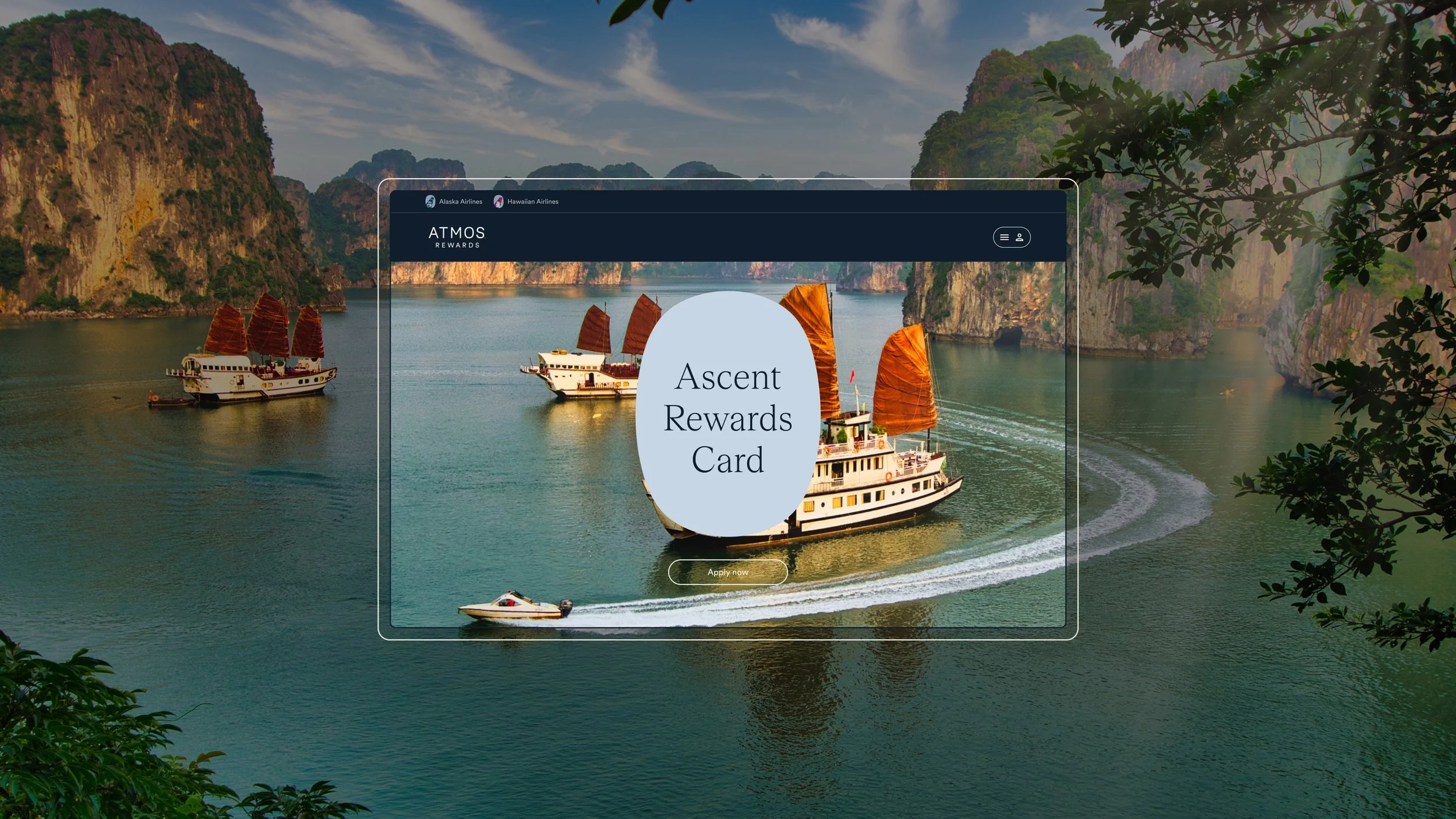
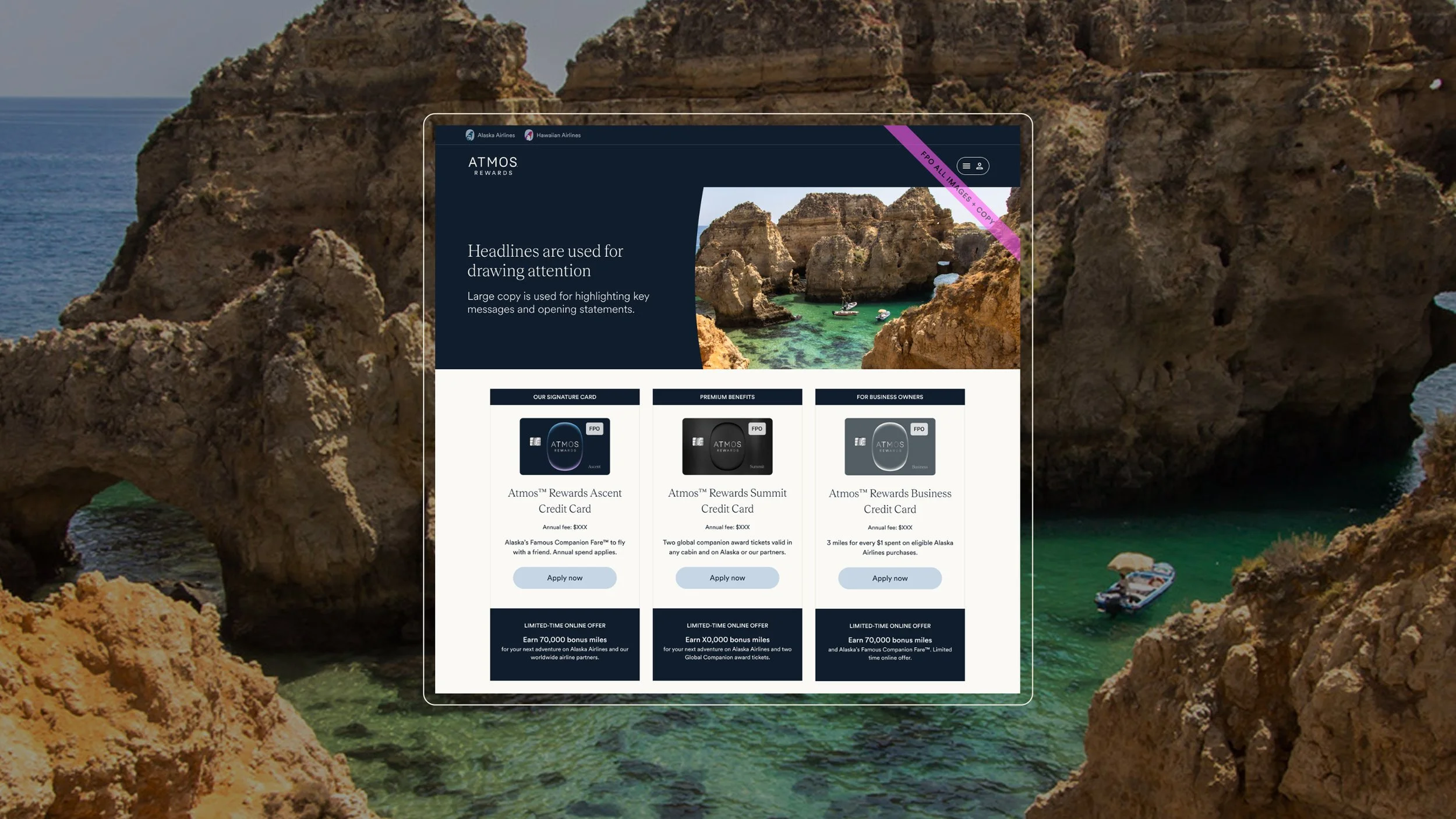
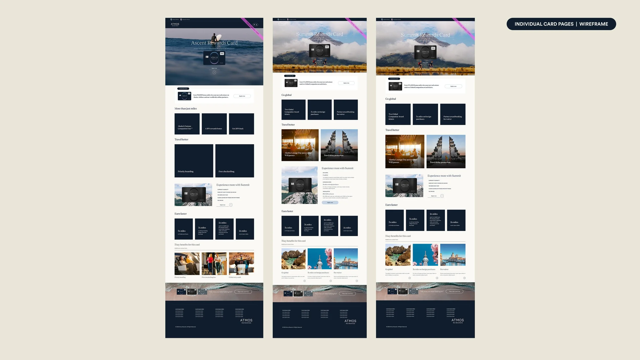
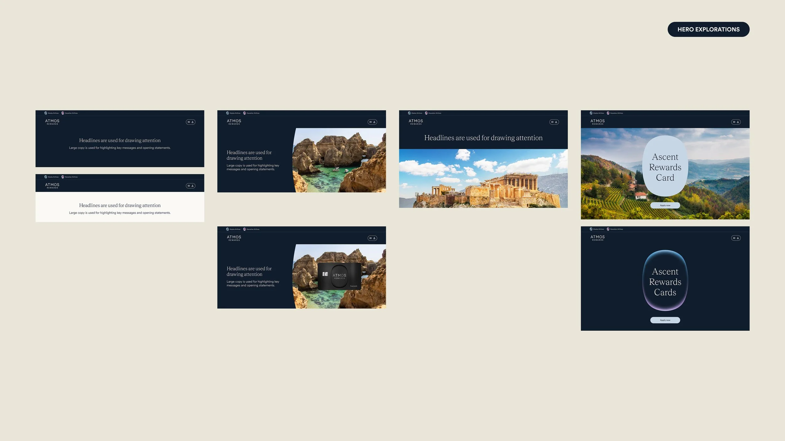
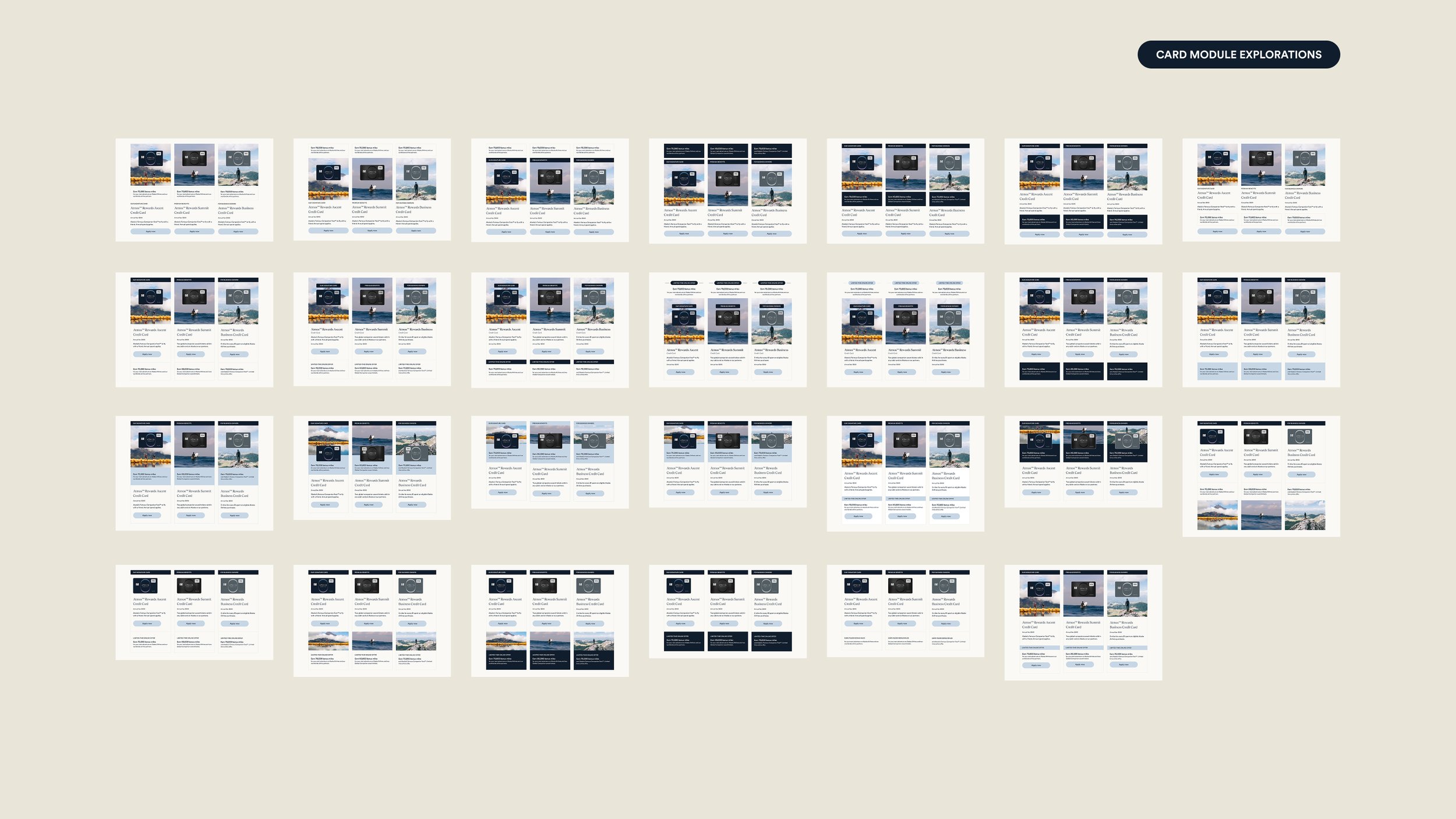
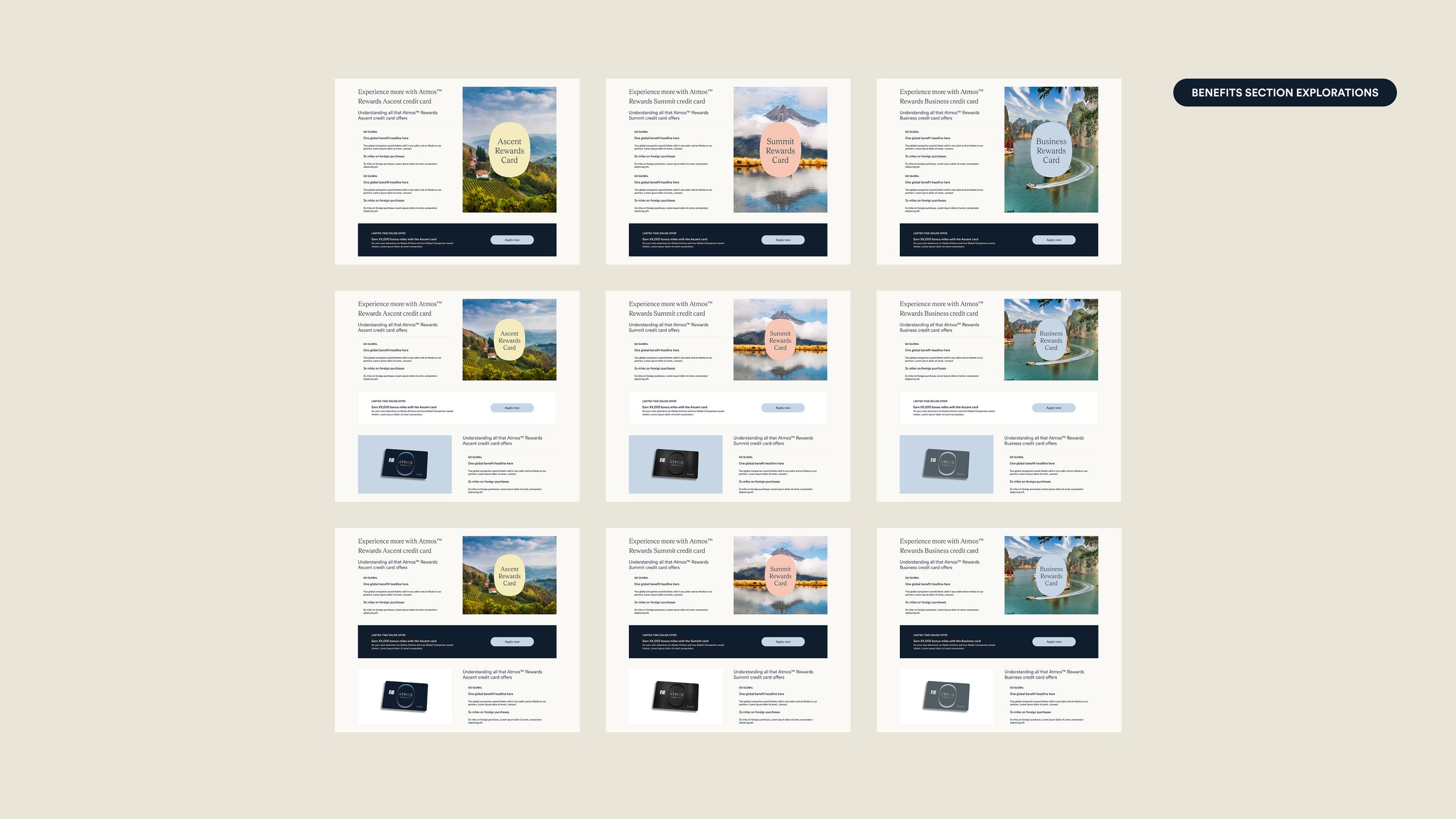
This required a careful dissection of the brand guidelines set forth by Atmos and beginning to interpret them specifically for the content experience. I took a close look at each content type and section of the page by style. These sections included: heroes, image treatments, card grids, banners, benefit modals, and benefits sections, and then combining these into cohesive designs.
I began by gathering all initial work done for the Atmos homepage and account space to understand how the brand was coming to life in those environments. I also pulled examples from other websites that felt inspirational. The bank provided some visual and content direction they recommended, and internal leadership shared guidance as well.
PROCESS
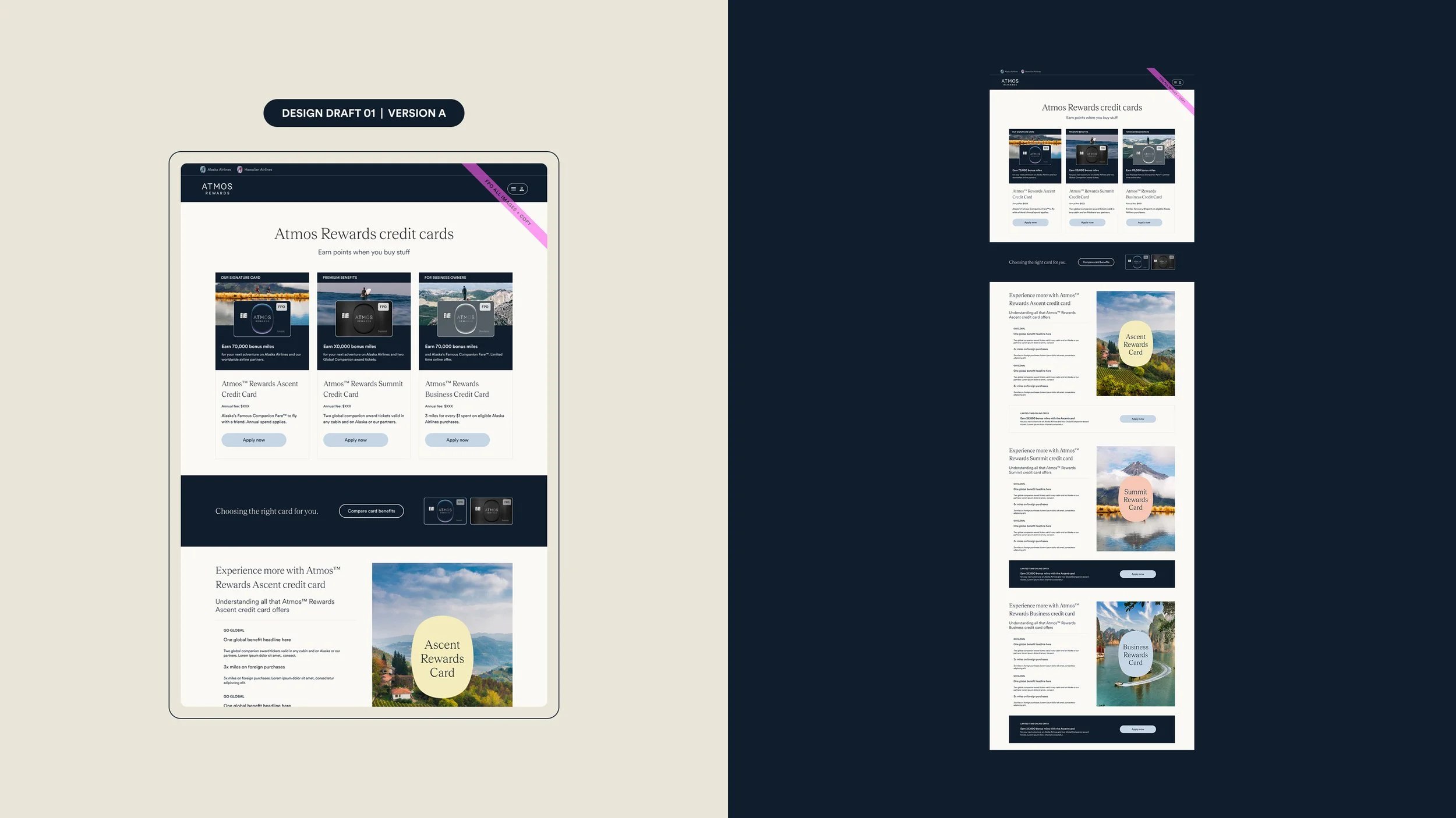
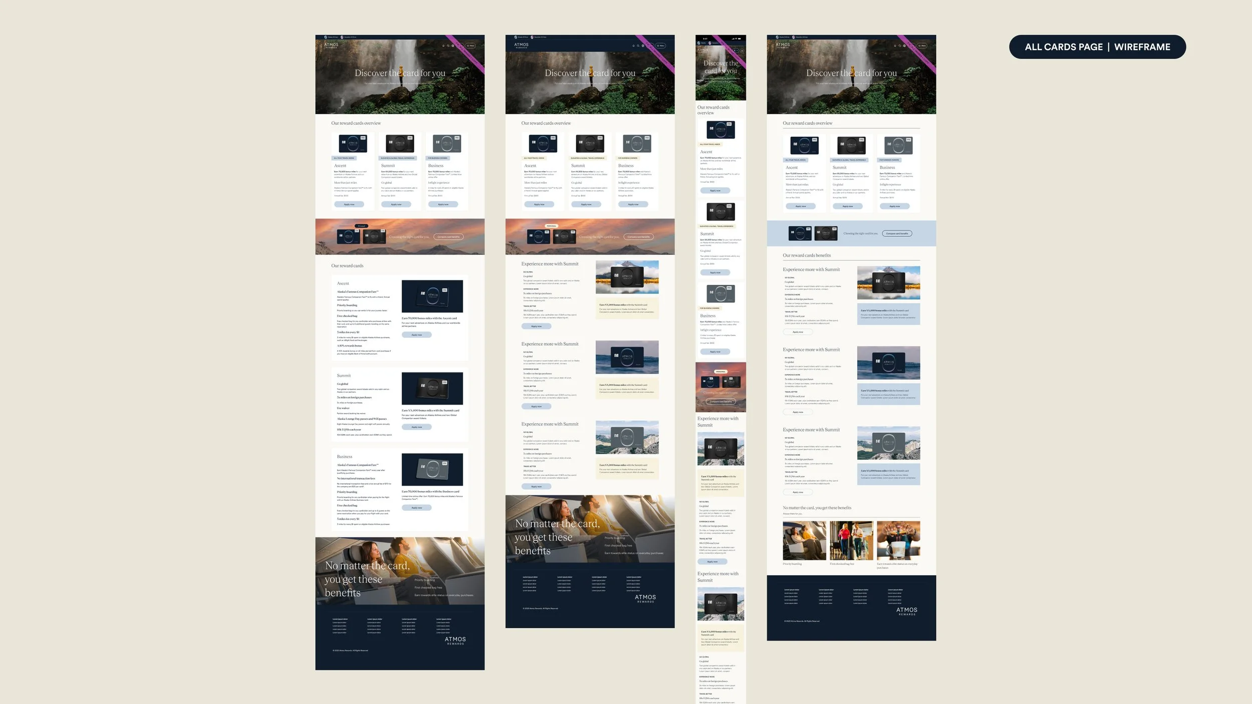
Started with high-fidelity wireframes with very limited direction or strategy from loyalty team and stakeholders.
I was pulling content from a small set of slides from the loyalty team that outlined what the new programs offered with some initial details. The remaining content for these wireframes came from the existing site and by referencing what other airline loyalty cards offered.
This was a very self-driven project. There was no official brief or project outline provided. I sourced the content for these designs independently, and there was no copywriter involved at this stage.
PROCESS
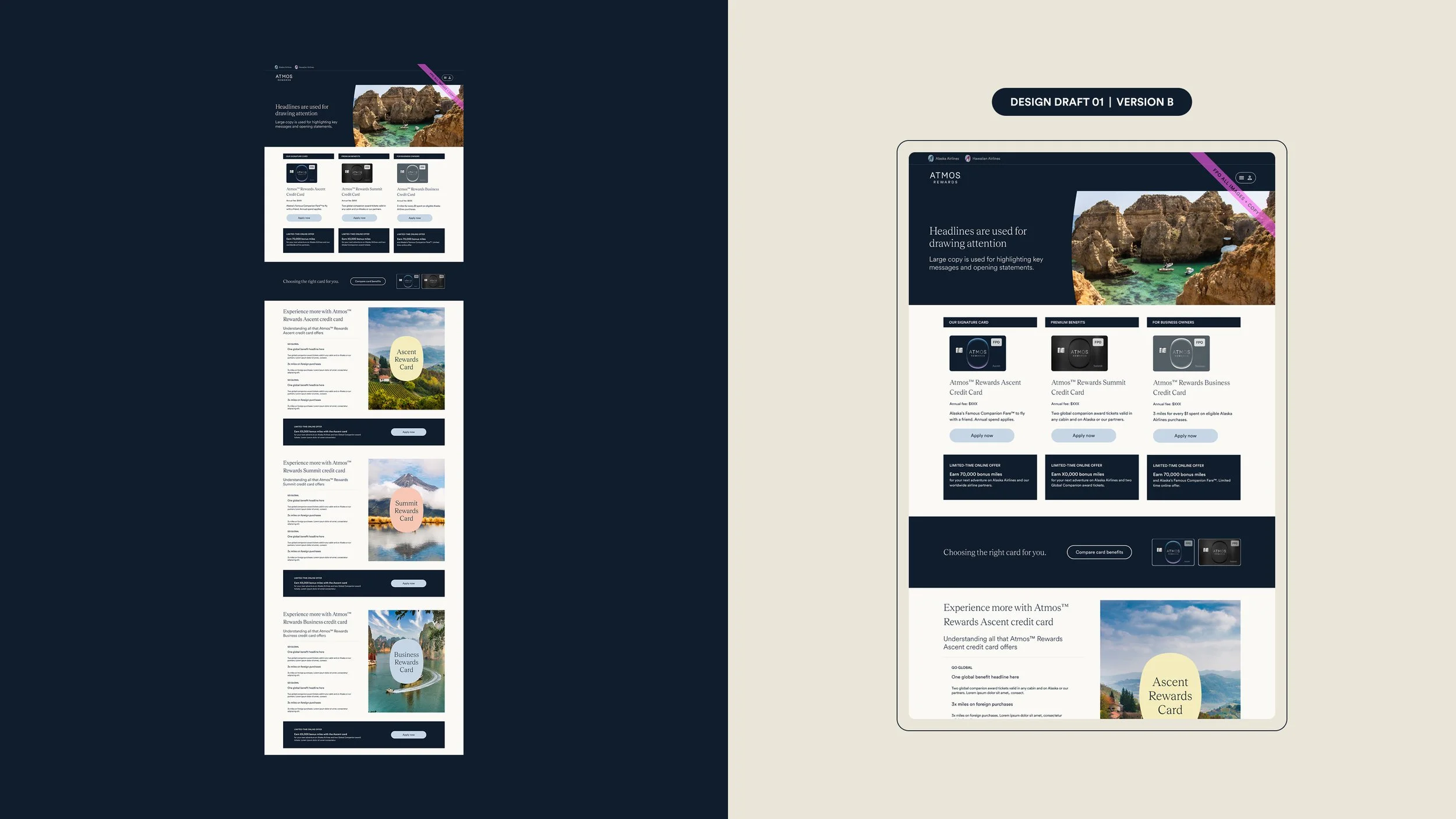
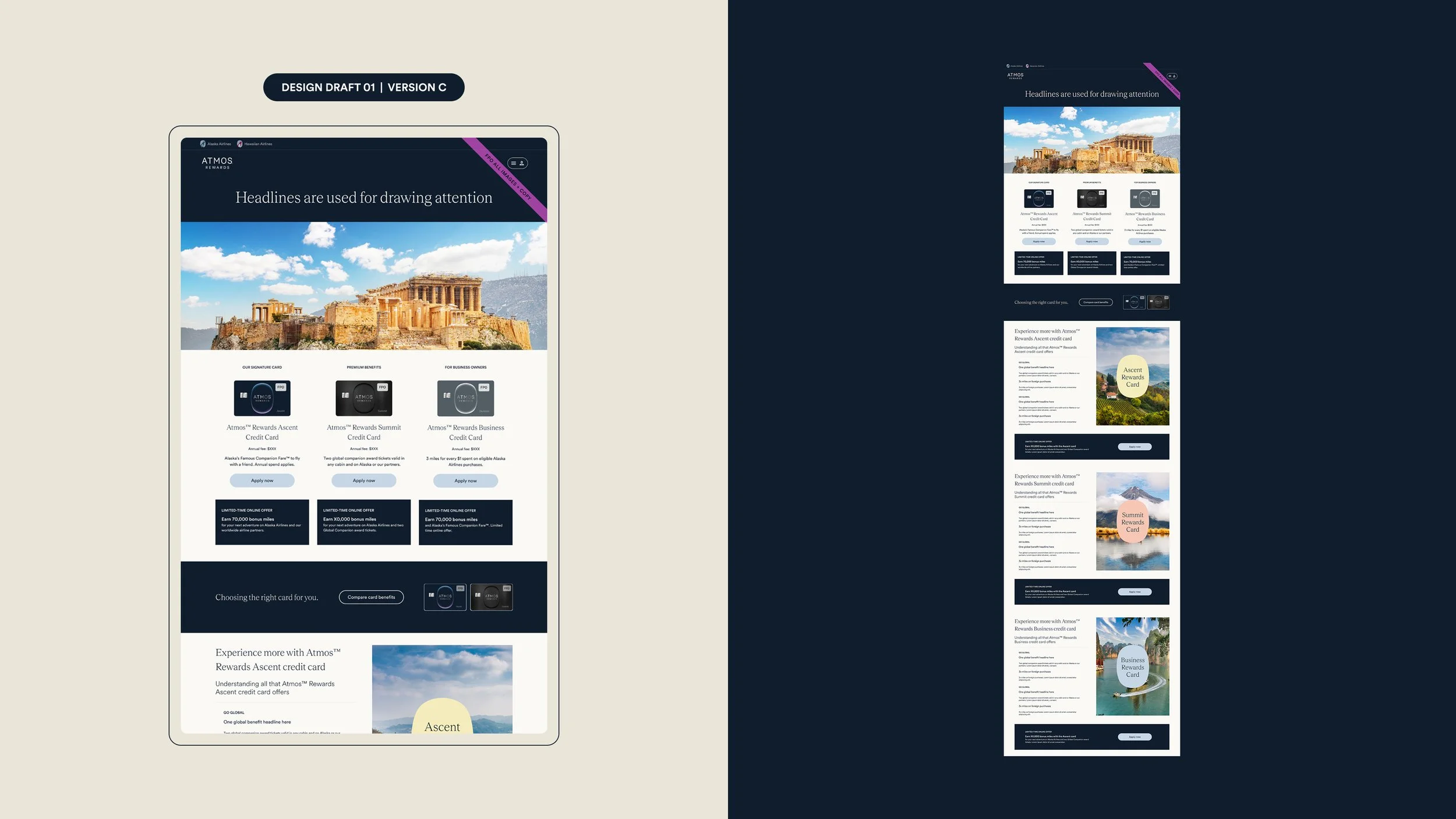
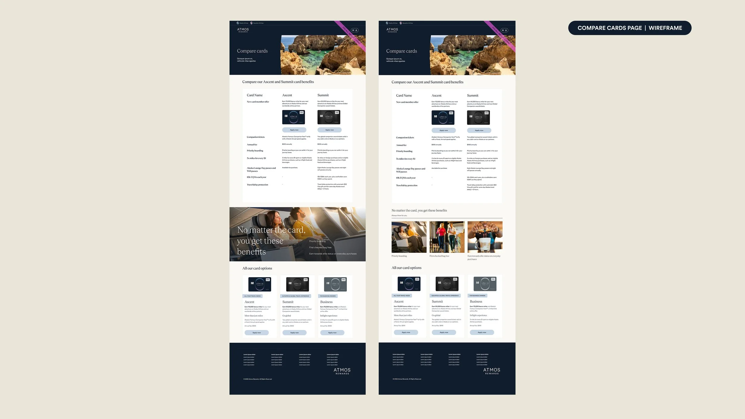
After stakeholder feedback on wireframes, began digging in further focusing more on the brand new Atmos style and how that translated into content pages.
My high-fidelity wireframes were shared with the broader team, including the AS loyalty team and the BofA bank team, for initial feedback on direction. They were very well received with minimal feedback. The team appreciated that design was working ahead to demonstrate how this space could function with a fully refreshed approach. They wanted to provide stronger direction on program language, define the overall content strategy more clearly, and continue collaborating closely.
I then broke out the different content types I had identified as likely to be used on the page and evaluated how each would translate into the new Atmos brand style. Heroes, image treatments, card grids, banners, benefit modals, and benefits sections.
RESULTS
Once those explorations were complete, I began assembling the strongest concepts into more built-out designs for the pages, focusing specifically on the three-card overview page.
My work became the foundation for the team and designers to reference, not only for the continued bank work but also for content pages across the broader Atmos site. I was not able to continue the project as I went out on maternity leave, but was able to set the team up for success with this foundational work.